I like to experiment with data visualisation in my spare time. I can only work on this intermittently and I'm always busy testing different visualisation styles, so I need to keep solid notes to preserve my train of thought. Jupyter Notebooks help me do this: I can combine live visualisation code with written text in a single, interactive document.
It can be daunting to get started with Jupyter Notebooks, though. In this post, I'll explain how I use it step-by-step. As an example, I'll be using OfferZen's public dataset to visualize the frequency distribution of a technology against different company sizes, using a Jupyter Notebook. Let's dive in!

What I'm setting out to do
What I'm trying to visualise: I'm keen to see what size of companies use the technologies that I'm interested in. Using OfferZen's public list of companies, I can see both what technologies SA companies use (for example: Java, ASP.NET, Amazon EC2) and how many employees they have (for example: 1-15, 16-50, 51-200). Given a specific technology like Java, I want to determine if it is more popular amongst startups, mid-size companies, or large corporates. I'm therefore setting out to plot the number of companies using Java against the how many employees those companies have.
How I'll do it: I'll be setting up and using a Jupyter Notebook. Without this, I would've had to write my own web app and serve the visualization as part of the web app's pages. If I wanted to keep track of my thoughts, I would've had to make comments in the source files or keep notes elsewhere. With Jupyter Notebooks, though, I can get started much more quickly than with a web app. I can also combine code with text — in other words: do literate programming — to keep notes on my train of thought alongside my code.
Note: If you want to 'cheat' and see the final product before we dive in, check out this live version.
Step 1: Understand how everything fits together
Note: This blog post assumes that you have a basic understanding of Docker, Git and Python. If not, check out the links for cool tutorials to learn more about them.
Jupyter Server, running in a Docker container
Jupyter Server is the web application that allows me, the user, to create and interact with Jupyter Notebooks. Instead of installing Jupyter Server and its requirements directly onto my local OS environment, I use Docker to run it inside a container. This is a faster and easier way to go about it, because I can set up everything from a template. It's also much cleaner: I don't have to 'pollute' my local OS environment with all the software packages I need for my visualisation project. Once I'm done, I can just dispose of the container to remove everything.
Jupyter Notebooks
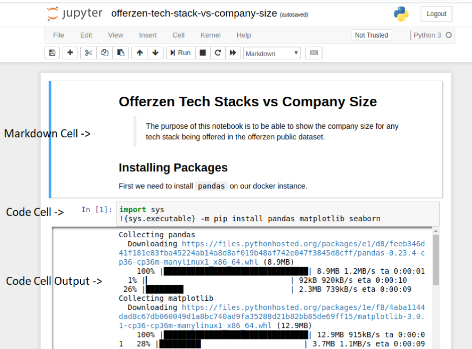
Jupyter Notebooks are where the real magic happens. A Notebook is a document. It lets me combine live code, in my programming language of choice, with narrative text and visualizations. In a Notebook, content is housed in so-called "cells". A cell can house one of three types of content: either "Code", "Markdown" or "Raw":
Cells need to run sequentially within a Notebook. The reason is that later cells require state information that is run in previous cells, for example setting variables and installing packages.
I find the term cell confusing, though, because of its connotation with tables. For the remainder of the post, I'll be using the word "block" instead of "cell" to refer to these content chunks, because it works better when speaking about code.
TIP: By default, all cells are code blocks. To get Markdown mode you need to change the cell type via "Cell" → "Cell Type" on the toolbar.
Important Python libraries
I'll be creating my visualisations in Python. I'm going with Python because I can get started super fast, using these two frameworks:
- Pandas: This is the framework that I'll use for data processing. Its most important data structure is the DataFrame object. DataFrame is a 2D structure that allows for columns of different types, if required. A DataFrame has built-in querying as well as statistical operations available.
- Matplotlib: This is one of the most popular base frameworks used for plotting data in visualizations. It's a 'base' framework because other frameworks, such as Seaborn, typically build on Matplotlib to provide extra functionality.
- Seaborn: Seaborn is the main data visualization framework. It integrates with Pandas and Jupyter. This makes it possible to render visualizations within a Notebook.
To be able to draw on these dependencies in my visualisation project, I'll need to install them alongside Jupyter Server in my Docker container. I'll add them in a code block at the start of my Notebook, so they'll be installed as soon as I run the Notebook. More on this below.
Step 2: Get started
2.1) Install Jupyter Notebook with Docker
I will be using Docker to start an image with the Jupyter Notebook server. The 'jupyter-minimal-notebook' image is a good starting point, so I'll pull the Docker image with:
docker pull jupyter/minimal-notebook
2.2) Grab the tutorial code
I've set up a Github repository for this tutorial. It contains a Jupyter Notebook that you can use to follow along. Much of the heavy lifting is already done, so all that's left is to have fun, right? :) Grab it using:
git clone https://github.com/ShiraazMoollatjie/offerzen-jupyter-getting-started.git
Run the tutorial code with Docker
Now that I have the required Docker image and the Notebook, I can run the Docker instance. From within the cloned Git repository, I'll simply use:
docker run -p "8888:8888" -v "${PWD}:/home/jovyan/work" jupyter/minimal-notebook
${PWD} works in the same way as the unix pwd command. It will use the current working directory as the directory to associate /home/joyvan/work in our running docker instance.
Once you've spun everything up, Jupyter server will give you a URL to your Notebook. This is available on the Docker output and looks something like:
[I 20:57:40.423 NotebookApp] The Jupyter Notebook is running at:
[I 20:57:40.423 NotebookApp] http://(9b8a697b5148 or 127.0.0.1):8888/?token=2c4ed88f0e604b5ee48c733e651461a3c53919bb3b6457fb
I ended up using:
http://127.0.0.1:8888/?token=2c4ed88f0e604b5ee48c733e651461a3c53919bb3b6457fb
Step 2: Onwards to our first Notebook
Now that we have a Jupyter server running, I'll set up my first Notebook, so I can show you my workflow. I'll use the obligatory and traditional Hello World Notebook to get this done. To make the Hello World Notebook, I simply add a code block that says:
print('Hello World from Jupyter!')
To run this in the Notebook, I click the "Run" button or simply use CTRL + ENTER. If you use SHIFT + ENTER, then your code will be interpreted and you would be able to type into a consecutive block.
Now, let's dive into some data visualization. Before I go any further, I need to import the libraries I'll need. So in the Notebook, I'll add:
import sys
!{sys.executable} -m pip install pandas matplotlib seaborn

import pandas as pd
from matplotlib import pyplot as plt
import seaborn as sns

%matplotlib inline
This will install the necessary modules needed for the rest of this post. That last line tells matplotlib to make the visualizations appear inline — that is, as part of the output of running the Notebook.
Step 3: Time to read the data
I scraped OfferZen's public companies list and extracted each company's name, their listed technologies, as well as their company size. I did all of this as a preprocessing step. If I didn't, it would add unnecessary complexity to the Notebook because of everything I'd have to add for data scraping and cleaning.
NOTE: Data scraping is out of the scope of this post, but if you're keen to dive into this, check out the r/webscraping Subreddit.
The preprocessed data file is available in my Github repo as offerzen_company_size.json. This is an array of JSON objects representing company-technology-size relationships: there's one element for each company's use of a specific technology. It has the following shape:
   {
        "name": "&Wider",
        "tech": ".Net Core 2.0",
        "company_size": "1-15"
   },
In the above example, If &Wider uses the technologies "Node.js" and "ASP.NET" alongside ".Net Core 2.0", there'll be another two elements similar to the above to represent this.
I chose to preprocess the data into this format so as to have a flat/denormalized structure. The more normalized the data, the more processing would be required with Pandas to extract the specific data points I need. I prefer keeping things simple.
What I need to do now is use one of Panda's utility functions to load this JSON data into a DataFrame object. Think of it as loading a JSON file and storing its Key/Value Pairs into one of these DataFrames. This will allow me to perform handy operations on it, such as filtering, transformations, and plotting.
To read the data file, I simply use the following block of code in the Notebook:
df = pd.read_json('offerzen_company_size.json')
df
It's as simple as that. The second line (just df) is just for debugging: It allows me to view the state of the variable inside the Notebook.
Step 4: Visualise the Data
As a reminder, I'm trying to display the frequency distribution of one tech stack against for company sizes. This technology should be configurable in the Notebook, so that I can easily use the same logic to visualise the distribution for a different technology. It would therefore make sense to list all the potential technologies, so I know what I'm dealing with. I do this with the following code block:
df.tech.unique()
This line of code queries all the unique values of the property "tech". This will return an array of values and is displayed on the Notebook.
Now, I can select my desired tech stack. Then I can query the DataFrame to grab the necessary data for visualization:
technology = 'Java'

df_tech = df[df.tech == technology]
result = df_tech[['company_size','name']].groupby('company_size').count().sort_values('company_size').reset_index()
result
TIP: Try playing around with the 'technology' variable's value. See what happens!
What I'm attempting here is the following:
- I query the DataFrame to only return the data for our specific technology.
- Next I group the data by 'company_size' in order to build up a histogram, sorted by the company sizes.
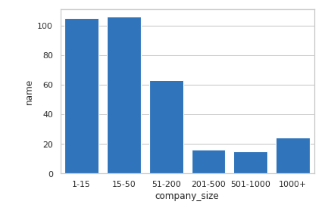
I want to be able to view this using a bar graph. To start us off, I use the following code:
plot = sns.barplot(data = result,
            x = 'company_size',
            y = 'name')
Here I'm telling Seaborn to render a Bar Graph using the:
- result as the data source
- The company_size property/column on the x-axis
- The name property/column on the y-axis
This gives me the following visualization:
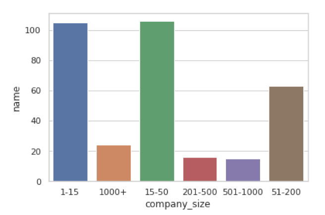
This is a good starting point. Congrats if you followed along this far! There's still room for improvement, though. Consider the following points about the visualization above:
- The default color scheme is not ideal. It makes use of multiple colors, yet there is no specific meaning to the colors. For example, red is not a warning, so why bother using red?
- The order of the x-axis seems incorrect, so my brain needs to do some extra work to "imagine" the correct order. Perhaps I can do something about this?
- Perhaps I need a title and maybe rename the y-axis to something that makes more sense?
Step 5: Tweak the Visualization
Ordering the X-Axis
If I look at our original visualization, I see that the data is sorted in lexical order. This is not ideal because I'd preferably want to see the data sorted in numeric order.
What also makes things slightly complex is that the company_size column uses a string to represent a range (e.g. 1-15, 1000+), so I need to extract the first number in that range to get something meaningful. I'll use a bit of regex to help me with this.
In pandas, what we need to do is add an explicit sorted column that represents the weight to use for sorting. In the Notebook I now update the result block with the following:
result['sorted'] = result['company_size'].str.extract('(\d{0,})', expand = True).astype(int)
result = result.sort_values('sorted')
The visualization now looks like this:
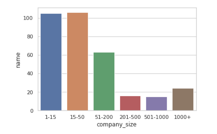
That already makes interpreting the data a lot easier. Now I can assume that the data is always sorted in the correct order and no extra brain power is needed for implicit interpretations.
Adding a Color Scheme
A color scheme can help the viewer interpret the data; it's typically used for visual comparisons. In the existing visualization, the colors are different for each company size range. It makes sense to keep a static color scheme to indicate that color is not important to us.
sns.set(style="whitegrid")
sns.barplot(data = result,
            x = 'company_size',
            y = 'name',
           palette = sns.crayon_palette(["Navy Blue"]))
TIP: How we use colour in visualisation is actually a complex subject; don't underestimate it! Diving into this in depth is beyond the scope of this post, but check out this Fundamentals of Data Visualisation chapter if you're keen to learn more.
You could use any colour, but I chose blue because it's friendly and does not distract the reader from the actual data in the visualization.
Title and Axis Renaming
I want to rename the axes to something meaningful for the visualization. To do this I need to change the plot as follows:
sns.set(style="whitegrid")
plot = sns.barplot(data = result,
            x = 'company_size',
            y = 'name',
           palette = sns.crayon_palette(["Navy Blue"]))

plot.set_title(f"Number of companies vs company sizes that offer the Tech Stack '{tech_stack}'")
plot.set_xlabel("Company Size")
plot.set_ylabel("Number of Companies")
Here I'm simply configuring the seaborn visualization using its exposed API. Seaborn has a range of settings that I can tweak, which makes it flexible — but sometimes also complex! — to make my improvements.
This gives me my final visualization:
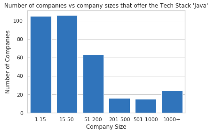
This visualization looks more complete. It describes my data sufficiently and I can clearly view the results that I'm after. Looking at the visualisation, I find it surprising that there are many small companies that still use Java. Keep in mind that we're using absolute company numbers (for example: 100 companies) instead of the proportion of all companies (for example: 100 out of 500 companies = 20%), so if there are more smaller companies in the broader dataset than there are larger ones, that'll obviously reflect in the visualisation as well.
Things to try and consider
- Use a different technology (change the "tech" variable) and see how the visualization changes. Is this what you expected?
- Does this visualization lead you to ask other questions about the data? In my case, the results make me want to see a percentage ratio of the company size offering the tech stack to all companies. I'd want to know whether the 100 "1-15" companies are 100% of all "1-15" companies or just a small percentage. This is exactly what I love about data visualizations: It leads to more interesting questions.
- Use a different type of visualization, such as a horizontal bar graph.
- Play around with the graph's colouring.
Pull requests to the Github repo are very welcome!
Shiraaz Moollatjie is a Technical Architect at CSG International and an avid data visualisation enthusiast.
If you liked this article, you may enjoy Using Flutter to Build a Mobile Data Visualisation App.