Today's tech world is underpinned by large amounts of complex data. Unfortunately, we humans simply aren't wired to draw useful conclusions from this. Data visualisation helps us get around the problem by making hard-to-grasp data accessible through easy-to-understand visuals. Shiraaz Moollatjie is a Technical Architect at CSG International and an avid data visualisation enthusiast. Here, he shares how he got started.

Tell us about yourself and your interest in data visualisation.
I'm a technical architect who also likes to code a bit in his spare time. I'm responsible for the architecture of our current product suite, as well as for thinking about the direction of our product architecture in the next 3-5 years. As a technical architect, I use data visualization at work when I need to communicate complex data to justify a decision. However, I also like to play around with it as a hobby in my spare time.
I'm interested in data visualisation because it enables me to make people think less. If I can transform a problem that's really complex to talk about or reason with into a simple chart/graph, I generate far more interesting conversations after the fact. This is because the visualisation let's my audience and me see the same problem in a different way. People start asking questions that they never thought of before and the innovation just trickles through easier. It's amazing to be able to do that to an audience.
How did you get into data visualisation?
When I started my career as a developer, the features that I was working on involved displaying hundreds of rows of data in grids and lists. I started putting myself in the user's shoes and asked: Am I really getting value out of reading hundreds of rows? I can guarantee that after reading all of them, I certainly won't remember what I read in row 35! Surely there's a more effective way of displaying these things? I remembered a professional communications course that I did in university, where one of the modules was about presenting data to your stakeholders. I used the reading from that module as a starting point for exploring data visualisation, discovered a bunch of other resources (see below), and went from there. That's where my interest in data visualization really started.
What did you think was going to be challenging and what turned out to be the actual challenge?
I initially thought that finding and learning a data visualisation framework for my main programming language at the time (Java) was going to be the big challenge. My first thought was: How am I going to implement these visualisations in my application? In other words, how can I find something that would work for my specific context. How can I bind the application's data model to one that works for the visualisation? Once I found that I could separate the concerns of retrieving data to visualise from the actual act of visualising data, I realised that I could get up and running with any visualisation tool.
The bigger challenge, it turned out, was to get buy-in for adding data visualisation into a product from the product managers, the development team, and the rest of the architecture team. We were working on a mature, monolithic product. Therefore, any medium to large-scale change in the system involved quite a bit of ceremony and red tape, such as architectural reviews, and approval processes. Working through this was challenging.
I find that many people in our industry view data visualization as a very technical subject. Because visualisations are graphic and often interactive, people think that there's a significant effort involved in coding all of this. This may have been true in the past, but now there are many mature libraries with good documentation that are ready to be plugged into your application. The challenge is to shift people's minds on this.
What have been your most interesting experiences with data visualisation so far?
The first time I flexed the data visualisation muscle at work was when I wanted to communicate complicated performance improvements in our application. I remember using simple coloring in comparison tables and a line chart to represent this. The visualisation worked well. What made it interesting was that after doing this, I noticed my manager started trusting my opinion on data visualisation a lot more. This was great, because it set me up to offer input on data visualisation later in my career.
In my spare time, as a hobby, I've shared two home-made data visualisations on LinkedIn. I scraped OfferZen's publicly-available company data and put it to creative use, beyond how it's used on the OfferZen platform itself. I created a bar graph showing the most popular technologies used by companies and a word cloud showing the most popular perks offered by companies:
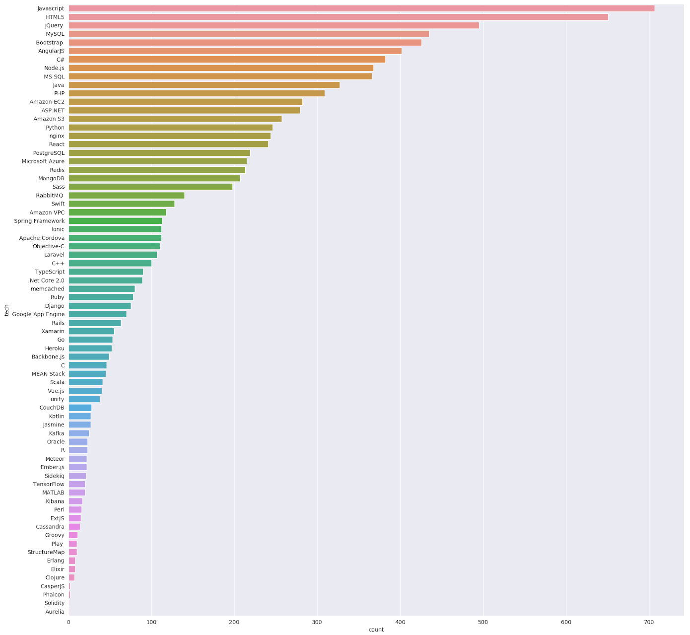
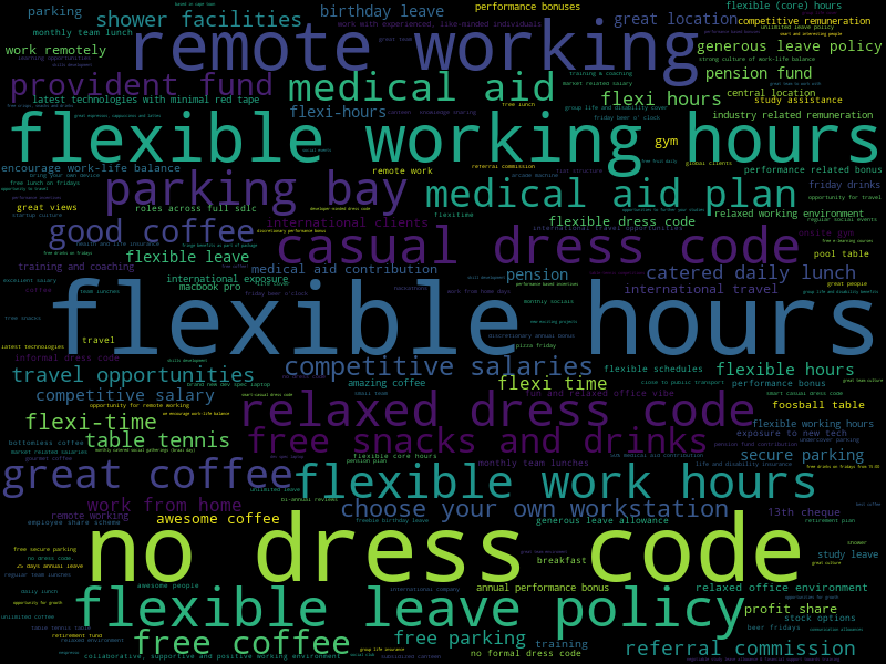
The response came as a big surprise to me. I was just doing it for fun and didn't think people would be interested in it. I expected the visualisations to get less than 100 views, but each of them ended up getting around 2,000 views. My take on why it generated such a response was that the information is easy to digest and the aesthetics make you want to share it. What I really enjoyed was the conversations that flowed from the posts. For example, someone asked me to reverse the intention of the perks data, to show the least offered perks. This was an amazing request to receive, because it's unlikely someone would've asked this if they didn't see the tag cloud in the first place!
Resources
These data visualisation resources have helped me a lot.
- Books: My favourite data visualisation book is the Fundamentals of Data Visualization by Claus Wilke. It's a fascinating book that helped me understand proper data visualisation theory.
- Websites: I go to the Data Visualisation Catalogue for inspiration and WTF Visualizations to learn what not to do. The Data is Beautiful subreddit is a great community. It's cool to see the visualisations that people submit, but it's also fun to play around on my own with the data that people share. You tend to find out new things about your hobbies and the world around you. I think that's cool.
- Frameworks: I have looked at Python (matplotlib, Jupyter notebooks, Seaborn), JavaScript (D3, Raphael, and ChartJS), and other frameworks (R, Tableau). I like the Jupyter notebook + Seaborn combination because it helps me preserve and revisit my learnings. I do this mostly as a hobby and I don't work on visualisations everyday, so it's useful to see my previous thoughts on visualising a specific set of data. If I were to develop something web-based, I would probably end up using D3 or another framework built on top of D3 because it's well supported and has a good development community behind it. This makes client-side visualisations easier to manage.
If you liked this article, you may enjoy Using Flutter to Build a Mobile Data Visualisation App.