It’s easy to fall into the habit of using metrics for the sake of using metrics, and to have something to report on. But often this can be more detrimental than beneficial. I will use my experience to share what I have learned about crafting useful metrics, and provide a tangible method for actively tracking improvement in a team’s behaviour with those metrics.
| TL;DR - A metrics toolbox |
|---|
| 1. Start with standard metrics used in the Scrum and Kanban frameworks. |
| 2. Collect data daily; analyse and learn from it. |
| 3. Relay the data to the team, and then discuss and generate insights to act on. |
| 4. Craft new metrics to measure behaviours that aren't currently measured by the standard ones. |
| 5. For each new metric crafted, repeat steps 2 and 3. |
| 6. Critically assess each metric used, and use assessments to iterate and improve. Ask yourself: "Is it objectively doing its job? Should it be tweaked? Has it been gamified?" |
I recently joined my team as an Agile Specialist. The problems we were aiming to address ranged from incessant “external” influences, that made planning almost utterly ineffective, to a lack of focus towards delivering specific, coherent themes with user-centric functionalities - rather than engineering-centric.
From the onset, my challenge was to highlight the positive effects that an agile approach would have on my team and on our results. It becomes demoralising when, in a team of diligent, mature, skilled and professional individuals, no one is able to see or experience the results of all the hard work being put in.
This is where metrics become an invaluable tool: With carefully crafted metrics, common pitfalls are avoided, positive changes in team behaviour are brought about, and it’s easier to visualise the results of measured-efforts earlier.
As an avid practitioner of, and believer in, agile principles and values, I have learned that using metrics is one of the most tangible ways to visualise the fruit of “uncomfortable”, self-selected, behavioural changes.
Good metrics provide objective and indisputable evidence of the effects of these changes. However, the challenge when crafting metrics is to ensure that they actually do measure the right thing, without causing team members to alter their behaviour in the wrong way. For example, we should not change behaviours so that they produce the correct figures, but rather focus on bringing about the desired improvements in the measured behaviours.
Below, I will illustrate these principles by recounting our use of a variety of metrics - some "stock standard" and well-known, and others crafted specifically for our team's situation. The specific problems that we were aiming to solve, by adopting corrective actions in our retrospectives, will also be explained.
Setting sail: Adopting agile, and crafting metrics
With my training in agile frameworks, such as Scrum and Kanban, it was easy for me to encourage the team to use the tried-and-tested metrics (and the charts they produce) in order to track our current behaviour and performance. We couldn’t know the course of behavioural changes to help plot towards where we wanted to go, unless we understood our current predicament.
The steps we took were as follows:
- We gathered data and assessed our current situation in terms of the team's throughput and velocity.
- Then, we determined where there was room for improvement, and had a discussion around strategies to encourage those improvements.
- We then started to address more team-specific behaviours that needed improvement, but there were no existing “standardised” metrics that we knew of.
- In these cases, we started to craft metrics in order to obtain the figures that would illustrate where we are, and allow us to plot a course towards where we want to be.
This has been our chronological journey so far, each step will be unpacked in more detail below:
- Planned vs Unplanned scope
- Quality vs Quantity of work delivered
- Process stability using the Cumulative Flow Diagram
- Backlog size tracking
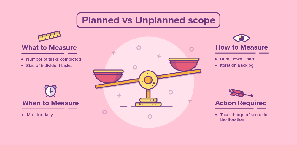
#1: Planned vs Unplanned scope
The first problem related to the fact that planning work for any period of time was essentially redundant because plans changed so often. The team's effort was being redirected to new, ”more important” work that had to be done immediately. This resulted in half-completed work being abandoned or forgotten, or ending up in production but never used. The team felt all over the place.
At this stage, no one was measuring or tracking anything: There were multiple task boards for everyone’s current work, which made communication ineffective and made it difficult to have a clear picture of anything. We had to start with the stock-standard metrics traditionally used in the Scrum and Kanban frameworks, and counted how many units of work we planned to do versus how many we actually did. That helped us understand exactly how “all over the place” we were. We could then consider what would constitute an improvement.
In this instance, we did not craft a metric, but used existing ones to first assess our situation.
First steps
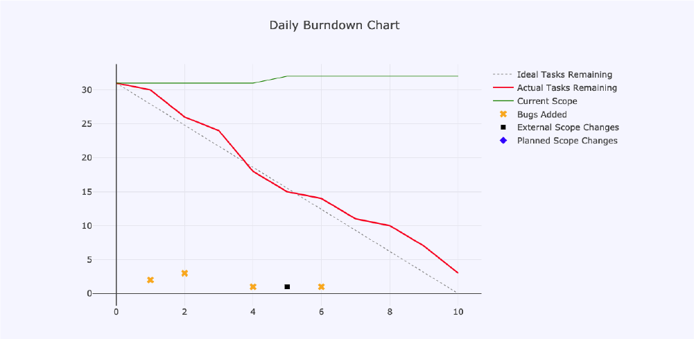
We planned some work for a two-week iteration and set out to do it. As expected, there were many unplanned tasks injected into the iteration backlog. Our first measured iteration's burn down chart looked like this:
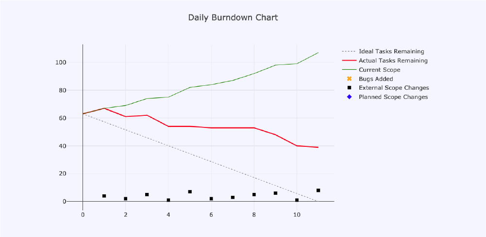
In the above burn down chart, as well as in the subsequent ones, we can see the following metrics depicted:
- Ideal Tasks Remaining: This is the grey, dashed line that goes from 62 at the start of the iteration, to 0 on day 11. It’s there to show us how behind, or ahead of, schedule we are each day.
- Actual Tasks Remaining: The red line shows us how many tasks we have left to do until the end of the iteration. Ideally, it should be on 0 on day 11 (in this case).
- Current Scope: The red line would be meaningless as a progress metric if we didn’t know what the total amount of work to be delivered should be, which is what the green line shows us.
The following items are not typically on a burn down chart, but we tracked them so that we could try to understand what exactly was having a negative impact on our planned iteration:
- Bugs Added: If a unit of work being brought into the iteration was a bug, we labelled it as such and simply indicated it on the chart as a yellow cross.
- External Scope Changes: The black squares on our burn down chart were added to illustrate just how often external work was introduced.
- Planned Scope Changes: Blue diamonds represent changes in scope, but these changes related to planned work that was under- or over-estimated.
With the above in mind, the story that this burn up chart told us about our behaviour and performance at that point in time is as follows:
- We had planned for a total of 62 units of work.
- With the unplanned, daily injections of external scope, we reached a total of 110 units - almost double the original scope.
- At the end of the iteration, we had 39 units left to do, which means we delivered 71 implemented units of work.
- Even though we delivered more work than had originally been planned, we only delivered about half of the planned work - and the rest was external, unplanned scope.
Now that we knew what our iterations looked like, we could figure out a way forward.
Developing a viable solution
We discussed what was feasible in terms of pushing back unplanned work. We felt strongly that we couldn't really do anything about the unplanned work. This meant that we needed to understand the impact of unplanned work, so that the team only took it on after due consideration of the cost - both in time, and money.
Things we decided to do, and which I will explain below, were:
- Plan for unplanned work
- Estimate the relative size and complexity of each unit of work using a point-system
- Plan for number of points, not number of cards
Planning for unplanned work
Rather than naively planning for 60 tasks, we planned for 30, with good authority from our metric data that more than enough unplanned work would come into the iteration. We produced the next iteration with the corresponding burn down chart:
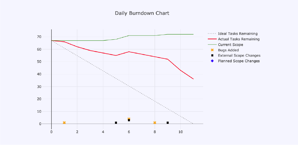
In this chart, the three black squares represent the number of unplanned scope tasks that were introduced over and above what we anticipated.
This chart also illustrates, however, that a lot of remaining work was left at the end of the iteration. To understand this, we simply took each card on our task board as a unit of work, but without any estimations. In the retrospective discussion for this iteration, we acknowledged that not all units of work represented by the cards on our board were of the same size; some were inherently large and likely to span more than one iteration, whilst others were small, quick wins. Our natural next step was then to understand the size of the units of work that we were taking on, and to limit them based on their collective size rather than the total number.
Estimating relative size and complexity of units of work
While human beings are notoriously bad at estimating how long it takes to complete a complex unit of work, we are exceptionally good at making relative estimations: For example, "Thing X is twice as big, or a quarter of the size of thing Y."
We decided that it would be helpful to move from a no-estimates approach, to estimating the relative size and complexity of each unit of work. This would enable a better understanding of these size differences and trigger story-splitting activities where necessary. In agile-speak, story-splitting is the process of breaking down larger units of work into smaller, more manageable units that can be completed comfortably within a single iteration. Our goal here was not so much the estimate itself, but rather the conversation it sparked about the unit of work, and the shared understanding that the conversation promoted.
Another point worth noting is that time estimations tend to cause undue stress on the teams doing them. More often than not, when management is given time estimations, they are easily tempted to consider them as commitments, rather than educated, and often optimistic guesses. Thus, many agilists prefer to steer away from estimating work in time.
In order to follow this thinking, we decided to estimate outside of time constraints, and use the modified Fibonacci Series comprised of the values 0, 1, 2, 3, 5, 8, 13, 20, 40, 100. These values are often used in an estimation game called "Planning Poker" popular in Scrum teams. We decided that 1, 2 and 3 would mean “small”, 5 and 8 would mean “medium” whilst 13 and 20 would be “large” and “extra large”. The values 40 and 100 were defined to mean “too large for one iteration” and “we really don't know how big this unit of work is.”
Next, we looked at some tasks that we had already completed, and assigned point values to each using the above semantics. Now we could use these tasks to comparatively assess the size and complexity of any new work we might consider taking on in a future iteration, and we could do this by assigning the relevant point values to them. As team members wanted to reach a consensus on the point values assigned to tasks being estimated, they needed to engage in conversations, which ultimately lead to shared understanding of each task’s size and complexity.
Planning for number of points, not number of cards
Using the size and complexity values, we moved away from planning around the number of cards, and rather for the number of points. We did this by using our previous iteration's total delivered points as our basis for the size of our new iteration backlog. This produced the following chart, which illustrated that our retrospective actions were yielding favourable results:
Using the stock standard metrics and devices, such as burn down charts and relative estimation of units of work with the modified Fibonacci Series, we were able to take control of our iterations, and both understand and take charge of the quantity of work we undertook.
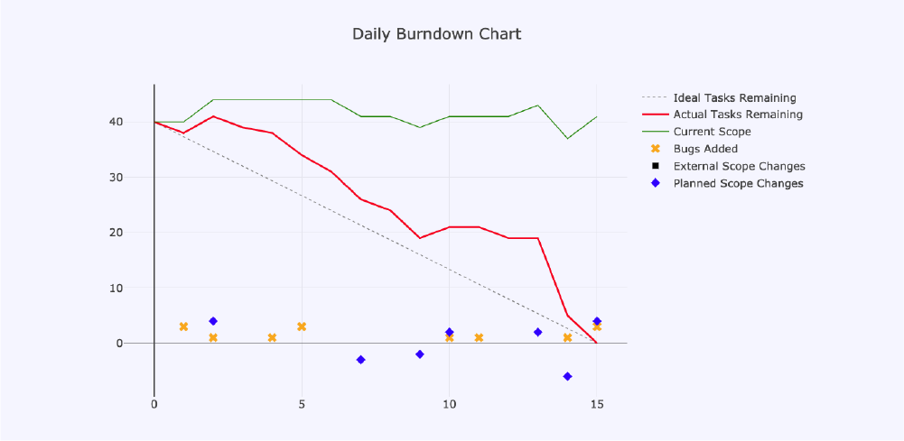
Fast forward to our most recent completed iteration, and our burn down chart tells a story of a team that owns their iteration! They are fully in charge of the scope they take on, and add and remove tasks as dictated by the needs they are there to help satisfy!
#2: Quality vs Quantity
Diagnosing the symptoms
Up until this point, we were focusing on our work quantitatively, and then our attention started to turn towards the qualitative aspects of the work we were delivering. This means that there was a need for our team to discuss, agree on and draw up a “Definition of Done”. In other words, how we defined a done item of work, which would directly impact the quality of what we delivered while ensuring that the following questions were answered:
- Have the relevant UX and UI designs being properly defined and implemented?
- Has the entire tech-stack been implemented (e.g. DB tables and stored procedures, API methods and integrations, front-end User Interface elements, etc.)?
- Is the user interface complete, with error checking and graceful results emanating from any and all, anticipated or unanticipated user interactions?
- Has the work been duly peer-reviewed?
- Has the work been integrated and tested into the main branch of the code repository?
- Has the work been deployed successfully into production?
- Is our work in the hands of our end-users, and giving them the value we created?
A “yes” to each of the above would mean that the unit of work that we delivered was of a high quality, and had the desired impact and return on investment that was envisaged by our Product Owner, who represented the interests of "The Business”.
After some team-wide learning, we decided that our Definition of Done involved some stages of completion. We wanted these to be reflected in the columns of our task board, which was constructed in accordance with Kanban principles. However, a task could not be considered “done” unless it was in the hands of our end-users; giving them the value of our work and us the value of their feedback to create better plans for future work.
To diagnose the symptoms, we ended-up following these steps:
- Carefully author cards either using the User Story (or Connextra) format or the Feature Driven Development (FDD) style, which are explained below.
- Track the types of tasks, such as User Stories, FDD features, Devops Work, Simple Tasks, and bugs, as well as how many of each are in our iteration.
- Account for relationships between card types. In other words, those linked to User Stories (and therefore end-user-facing), versus those that weren't.
First steps
We started off by considering that we needed to measure the types of cards that make up our increment, so we had to ensure that each card was properly labelled with a type. This allowed us to tally up the card types, which enabled us to pay attention to how cards were authored. So, we could ensure that each card had some sort of value proposition for someone in the relevant ecosystem, be they an end-user, a stakeholder, or a team member.
Using the User Story (or Connextra) format
In order to ensure that units of work are user-centric, our team resolved to express our units of work in the so-called Connextra - or User Story - Format: As a <Role> I want <Feature> so that <Reason>. If it couldn't be expressed as such, then we decided that a unit of work was not user-centric and would be labelled accordingly. This allowed us to create a metric that measured the proportion of each type of card on our board in a given iteration.
We also decided that an improvement in taking on user-centric work would be indicated by an increase in the proportion of User Story type cards. Other types of cards include "Devops/Infrastructure", "FDD Feature" (see Mike Cohn's article "Not everything needs to be a User Story") and "Simple Tasks".
Tracking tasks linked to User Stories
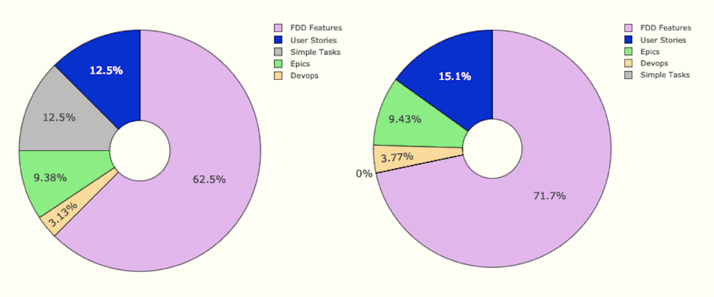
In the above two doughnut charts, we can see the distribution of card types in two consecutive iterations, which indicates a marginal increase in User Story type cards in the second iteration. After looking at this visualisation, we realised that it did not really tell us much. We felt that swapping the proportions of the blue and pink segments would be more useful, because the impact of our concerted effort to take on user-centric work would reflect more dramatically on the chart.
Accounting for relationships between card types
For a couple of iterations, we only had the doughnut component, which gave us the proportional breakdown of all our iteration's cards by type. The data was gathered and reviewed during the first iteration, and we came to expect that an improvement in the next iteration would be illustrated by a growth in the proportion of user stories. In practice, however, even though we did pick up more user stories than other non-user facing units of work, the impact on the proportional distribution was not really discernable.
When analysing the board to determine why this was the case, we realised that, in this tally of card types, the relationships between them was not accounted for. In fact, most of the non-user story cards were the result of breaking down user stories and epics into smaller sub-tasks. Many of these would each contribute towards the completion of their respective parent-tasks.
Developing a viable solution
To make this information useful, we needed to consider how many tasks are actually linked to user stories versus how many where independent, non-user facing work. That distinction was what we used to craft the metric to improve our behaviour of ensuring that more work was user-centric in every subsequent iteration.
This also added a new dimension to our doughnut charts above, in the form of a pie chart component that depicted the proportion of User Story-linked versus unrelated cards. In the first of the two doughnut-and-pie charts below, the pie in the middle tells us that more than two thirds of the work being done in the iteration is client-facing, whereas just under 30% is work relating to infrastructural work and Devops, or other tasks that the team deemed necessary to take on during the iteration.
A desirable improvement in our behaviour of choosing more client-focused work would, therefore, be illustrated by an increase in the proportion of User Story-linked cards in subsequent iterations. This is the case in the second of the two charts below.
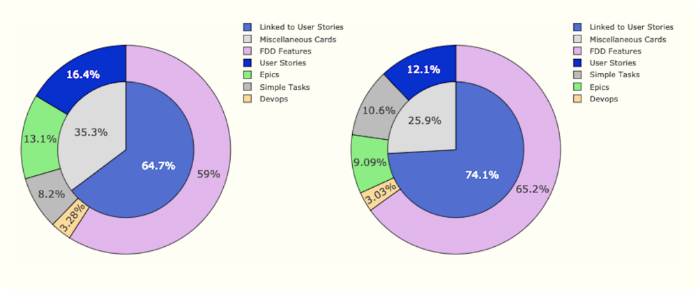
Essentially, the inner pie components of the charts are telling us that our focus on delivering end-user functionality paid-off, since end-user related work increased by nearly 10% after we started measuring it in this way. We still focus on this behaviour and this crafted metric remains relevant to what we do.
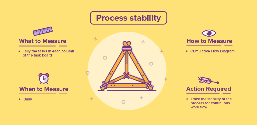
#3: Process stability and CFD
From the beginning, we started to maintain a Cumulative Flow Diagram (CFD), which is a favourite tool in Kanban teams. This standard metric can be used to gauge the effectiveness of the other metrics, and the behavioural improvements they track.
Essentially, a CFD gauges how stable and smooth our process is - so that it has continuous and uninterrupted value flow to the end-user - by reflecting the effects our behavioural changes are having. For example, in the first third of the CFD below, we see an oscillation of the middle collection of Work In Progress (WIP) bands which grows and shrinks in size at a point that coincides with our iteration size. As we focused on continuous delivery, we found that this smoothed out. In the last quarter, there's another, internal fluctuation in the WIP bands, which shows that we made changes to our process that just need time to become the norm and smoothen out.
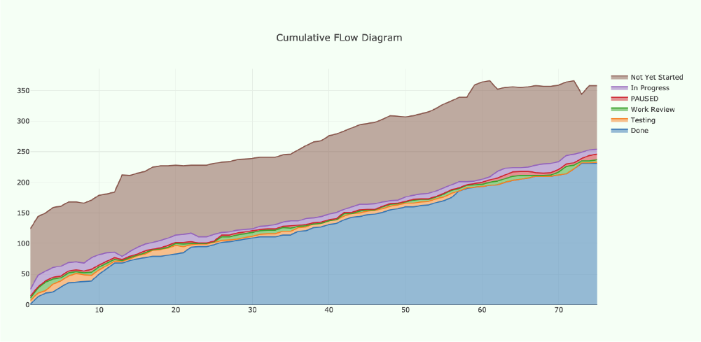
There are many articles explaining how to read CFDs, but this article explains how they can be used to measure the stability of a team's process. As a widely used tool among agile teams, we regularly use the CFD to easily monitor and analyse the information it provides - especially when we introduce major changes to our process.
Two metrics encapsulated in the CFD, however, are lead time and cycle time. The former is the number of days that it takes a unit of work; from entering our Product Backlog to being delivered as “done.” In our case, this is an average of 40 days. The latter is the number of days it takes for a task to be completed once it has been picked up for implementation. In our case, the cycle time is about eight days on average.
When contemplating these figures, we realised that:
- It takes about 32 days for a unit of work to be groomed from concept to be ready for implementation.
- And, it takes eight days for it to be completed once picked up as a WIP.
Furthermore, we noticed that it takes about two to three iterations for our process to smoothen out every time we bring in behavioural changes.
This is a significant insight because it makes us aware that whenever a new behaviour is introduced, or a new metric is applied, the effects will only show after a minimum of two to three iterations. In other words,** it would be counterproductive to “try things out” for less time than that.** Perseverance is crucial here, so take heed and act accordingly!
![]()
#4: Backlog size tracking
During one of our retrospective discussions, we asked ourselves whether everything in our Product Backlog was actually necessary and relevant. The team felt that the Product Backlog was cluttered and too big. Also, it was hard to see whether it was growing or shrinking after each iteration, so we had to make this visible somehow. Out of that discussion, the top-voted action was to do an aggressive culling of tasks older than a certain age. This would include tasks rendered obsolete since the cards were created.
To better understand our Product Backlog, we started measuring it. From the CFD, we extracted the data relating to the Product and Iteration Backlogs. To this data, we applied a linear regression, intended to illustrate the current growth or shrinkage trend. Thus, the following backlog size tracking charts were produced:
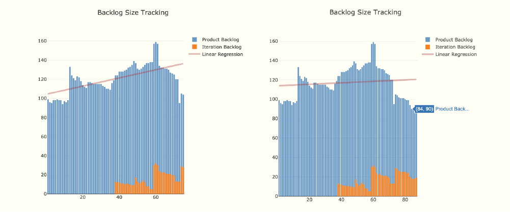
Each blue bar in the chart indicates how big the backlog is on that day, and the orange shows how much of the backlog is in the current iteration backlog. The linear regression helps us to easily visualise if our backlog is growing or shrinking.
From left to right, if the linear regression goes upwards, then the backlog is growing faster than we can deliver it, and there will be work we'll never get to.
Conversely, a downward slope indicates that we will run out of work at some point in the future as the backlog is not growing at a sustainable pace. The ideal would be a horizontal linear regression, which would mean that we deliver all the work that comes in at a steady pace.
In the first three quarters of the graph, the x axis slope was decidedly upward, indicating that the Product Backlog was growing too quickly for our team’s capacity. We had to consider a number of corrective measures, and identified three which we have been pursuing ever since:
- Dedicate a Backlog Refinement session to do an aggressive culling of the product backlog, and remove any “deadwood” that is no longer necessary.
- Employ a dedicated quality assurance and devops specialist who will lead the QA process and free up capacity for the software developers to focus on developing software.
- Employ a back-end developer to add capacity to the team once they are properly integrated and ramped-up.
Currently, item (1) above has become a continuous effort during our Backlog Refinement (BLR) sessions, and we have already managed to shrink the Product Backlog significantly as can be seen in the second Backlog Size Tracking chart above. We also better aligned it with our vision to deliver user-centric work.
Items (2) and (3) are being pursued, and soon the team will have added capacity after a suitable ramp-up time for the new-comers. This will eventually have the desired impact on the effective management of our Product Backlog, which will be easy to visualise through the slope of the linear regression applied to the Product Backlog size data.
Agile growth is a journey
Growing as a team in agility is a journey, and a long one at that. That said, perfection doesn't exist in human endeavour, and we should strive to derive joy from the continuous pursuit of excellence!
In our pursuit of excellence over the past four months, we've used standard metrics and the visualisation tools they produce such as burn down charts and Cumulative Flow Diagrams. We used these to understand that we needed to take control of our iterations and the scope within them.
Furthermore, we came to understand the impact of losing control of our scope as a team to external disruptions in the form of “quick”, “highly important”, “super urgent” work that just came in - however well-intentioned. Having the figures and the graphs they produced allowed us to tell our story with indisputable facts, not subjective-sounding opinions.
When the stock-standard metric devices did not help us gauge the behaviours we wanted to improve, we boldly crafted new ones that might do the job for us. We reviewed the data produced by these new, custom metrics and determined whether or not that data was conveying the information we needed. If not, we tweaked or replaced our crafted metrics, taking into account any lessons we learned along the way. In every single instance, the metrics helped us view situations objectively. Once we understood what was going on better, we could come up with meaningful improvements that everyone in the team bought into and championed because of the clear visibility provided by these metrics.
Having considered the above, what metric(s) would you put into place to assess where the team is now, and how could you measure improvements that may come about from any corrective behaviours you implement?
Duke Coulbanis has been interested in computers since the age of 12, and after school he enrolled at Deree College in Athens, Greece, for a BSc degree in Business Administration, with a major in Computer Information Systems. He furthered his studies with a BSc(Hons) in Computer Science at the University of Cape Town, and moved on to working as a developer in a company that produced software for the agricultural and wine industries. After 3 years in the winelands, he moved into the corporate world and developed software in Java for about 14 years, the last 3 of which were as part of a Scrum team. It was there that he fell in love with Agile and the humanity that it reintroduced into the workplace of a software developer. He crossed over into coaching teams in the pursuit of excellence through diligent application of the values and principles of agile software development. Duke believes, wholeheartedly, that TEAM means Together, Everyone Achieves More!