Every team has a mix of roles, and a range of technical to more non-technical people. This can make it challenging for software developers and data scientists to communicate effectively with each other, as well as with other people in their broader team, in a way that they understand. Daphne Cheung, Data Scientist at Disney, has used her background in business to hack communication in a way that lets her communicate better with anyone. This is her advice to help leaders help their teams do it too.
And you can download Daphne’s 5-slide presentation template here!
Daphne is the only data scientist in her development team, and part of that requires her to interface with network engineers, as well as other non-technical executive stakeholders. As a result, she is in constant communication with both tech and non-tech people within her organisation.
In the beginning, this cross-functional communication was hard for her to get right. She explains:
“The biggest challenge from a communication standpoint is that my role is very new to most of the people around me. They don't understand very much of what I do, and I’m still learning about what they do… Plus, being the only data scientist, I'm kind of building something from the ground up.”
However, her background in business management gave her the tools she needed to build a communication structure for herself and her team. Now, she’s able to communicate and translate all kinds of data with anyone she interfaces with — technical or not.
In this article, Daphne identifies the most common places that she experiences communication breakdown when it comes to translating and communicating data. She also shares her presentation structure, that tech leaders can use to help themselves and their teams communicate more effectively with one another.
Common pitfalls in team communication
As a data scientist, Daphne’s main role is to collect information from people in her organisation, turn it into data use cases, and communicate her findings to the relevant people:
“A lot of my stakeholders”, she says, “are what we call ‘data owners’ — people in charge of specific services, or who manage a network engineer who's an expert on network devices.” Together, Daphne and her data owners use network data to build a ‘picture’ of what a specific strategy looks like. “I would work with someone like that, and pull data from their devices to learn more about how they're performing.”
When it comes to communication, however, one of the main ways in which Daphne interacts with a data owner is during data presentation.
Although working with data is something she does a lot as a data scientist, Daphne says that presenting data is relevant for anyone doing discovery or development, because they’ll inevitably have to do research and present it to someone.
Presenting data: Speak to a person’s specific values
When presenting her findings, Daphne needs to condense a lot of context, research, and data into a succinct format. What makes it challenging, though, is being able to effectively translate her data into something the person she’s talking to can understand.
In her experience, this is a common place for communication to break down because many people present as if they’re presenting to themselves, and not to other people. However, she thinks this is really important for anyone in software development to get right:
“Knowing how to break down your technical products into five slides is truly an art form. It’s something I think all data scientists and developers need to know because projects take resources, and executives are not going to resource projects they don't understand. That’s the reality.”
Getting this right comes down to knowing who your audience is, what they value, and what they care about: “There are so many incredibly smart data scientists who build the coolest deep learning algorithms, but they don’t know how to communicate or translate that value to someone who is not a data scientist, and it just falls flat.”
Her approach is to structure her presentation in a way that speaks directly to what her audience values: “For example, they're probably not looking to hear about the complexities of the algorithm you're working on”, she explains. “They want to hear about how that algorithm is going to contribute to their bottom line.”
Here is the presentation structure she uses to help her keep her audience’s values top-of-mind and communicate like a pro when presenting data:
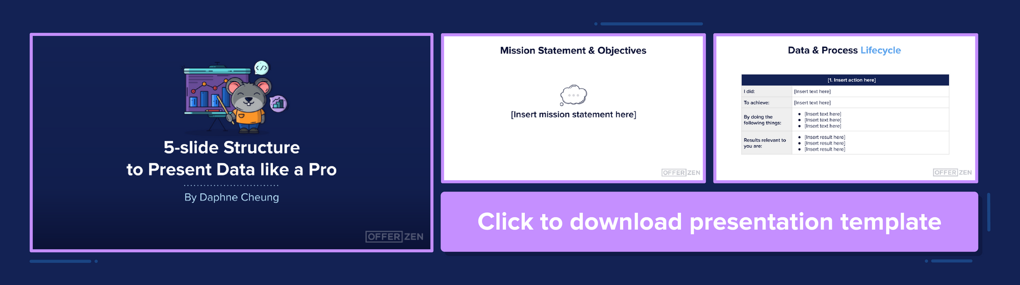
Remind your audience of your mission statement and objective
Daphne starts any presentation by getting everyone onto the same page, and reminding her audience of the original problem she set out to solve: “Often, people will show up to a meeting that you've pulled together and, even though they know what this initiative is, they’ve probably forgotten why you started doing it, why it adds business value, how this problem came to be — and this is your chance to remind them.”
Her opening slide is her guiding statement. It’s a one-liner that outlines the main objective she pursued for that initiative or that project. “And all the work we do hereafter”, she says, “should follow that statement, pursue it, and try to achieve your ideal communication outcome with that in mind.”
Tell them why they should care
Following that, Daphne tells her audience exactly why they should care about this presentation at all by speaking to their specific values. “I try to answer why this business problem matters to that executive, or to that engineer. Depending on the audience, this slide will change, but it's inspiring action with that particular audience member. It's inspiring those people to find value in this initiative and in this presentation.”
This not only draws someone in right from the start, and positions them at the centre of her presentation, but it forces her to think about what this person actually wants to hear. This makes it much easier to know what data to present, and how to present it so that someone will understand in later slides.
Walk them through your process and findings
Then, Daphne walks her audience through her data lifecycle. In other words, each part of the process she followed from to gathering, to collating, to analysing: “In my case, as a data scientist, I basically walk someone through the work I just did, step by step — and I always tell people that even this has to be tailored to the audience.”
To get that right, she thinks about what this person does on a daily basis, and highlights the relevant parts of her process and her findings that they would understand: “Gauge your audience and their level of understanding... and build that into your demo. If it's an executive, they probably don't want to hear about your algorithm — they want to hear what it produces and how that adds value. And even if you’re presenting to an engineer, they probably still don't know that much about machine learning because they're not data scientists.”
“At the end of the day, you do not want to present everything; you want to present the stuff that's relevant to the people you're presenting to.
End with ‘Impact’ and ‘Action’
Finally, Daphne brings it home by doing two things:
- First, she quantifies the value of what she’s presented. “This is the piece that a lot of data scientists forget”, she explains. “They forget to say, ‘This is the difference this is going to make’, or ‘We're going to save X amount of money and time’, or ‘We're going to reduce X amount of devices’.” She reiterates what she stated on Slide 2, and ties in the relevant data and findings from the previous two slides.
- Then, she gives her audience action items for what they can do next. “You want to tell people exactly how they can implement this tool, or what happens when this is implemented, or what they need to do next after they have watched this presentation.” By doing this, she’s making it far easier for someone to take in the information that’s been communicated, and actually move to action.
“Every time you're building a presentation, you're pitching something and you're talking to someone. If you want to move them to action, it's important to speak to their particular pain points and their particular roles. I always find that to be incredibly powerful for communicating with anyone in your organisation.”
By putting herself in the shoes of whoever she’s trying to communicate with, Daphne is better able to speak in a language they can understand, and speak to the things they care about hearing. “It really sounds so simple, and so high level, but I find that it works especially well in a technical space, because even though we’re all ‘engineers’, we’re all completely different and we all have different objectives, different intentions, and reasons why we do what we're doing.”
Download Daphne’s 5-slide presentation structure here! Or, if you’d like to reach out to Daphne, find her on LinkedIn!