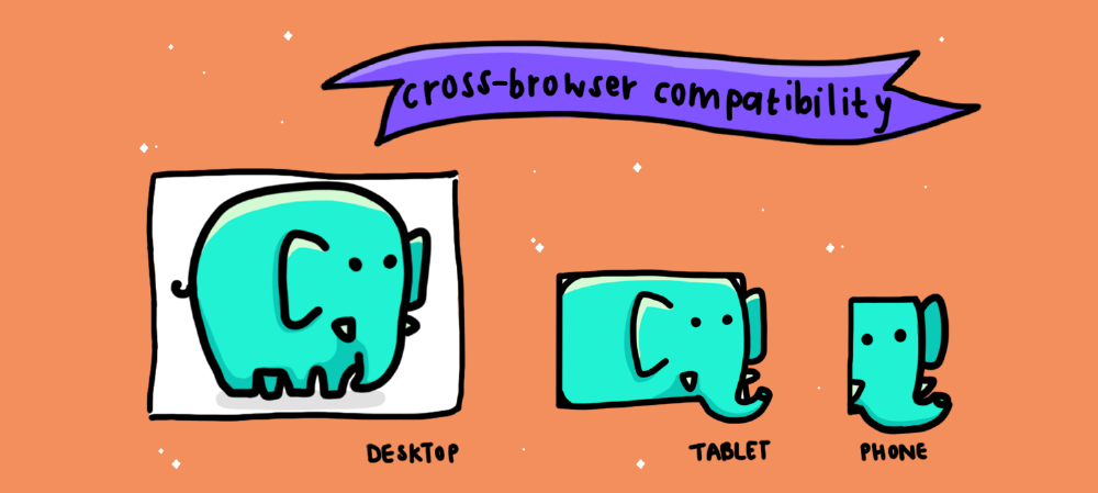
South Africans browse the web on a range of different devices: From low-end cellphones and computers with dated software and slow GPRS connections to high-end smartphones and top-of-the-line MacBooks with ultra-fast Fibre. This puts front-end developers like me in front of a unique challenge: We must deliver an engaging experience to users across this spectrum.
I work with the cleaning service company SweepSouth to deliver a high-end web and mobile experience for our customers across the South African digital landscape. We also provide our cleaning personnel with a mobile app that helps them to find and complete jobs. In this article, I will explain the obstacles to creating an engaging experience across different devices and how I overcame them.
My goal: Create an engaging experience for any user
There is no reason to allow a single user to have a bad experience when you have the time and resources to prevent it. For my team to create an engaging experience for the users of our website, we must ensure that:
The site performs well in terms of load time and data usage - A website that performs exceptionally:
- Does not leave the user waiting,
- Loads as quickly as possible, and
- Does not download extraneous assets to the user device.
It looks good on many different viewport sizes - ideally all of them - A website looks good if:
- It scales correctly to the screen size,
- Nothing appears broken or unreadable, and
- All of the necessary actions are in view and easily understood.
The user journey is always clear and easy to navigate - This means that an effective website interface is accessible to the user without them first having to decipher what they are meant to do to achieve an action.
Our main challenges with this are the following:
- We need to deliver a glossy, high-end experience to our main end-users because they tend to be tech-savvy and critical of app interfaces.
- This has to be done while also trying to capture late adopters who are skeptical of any inconsistencies and will leave if the experience is difficult or frustrating to navigate.
- Additionally, we also need to maintain our cleaning staff's app that runs efficiently with minimal data use across a huge spectrum of devices.
The main problem: Some South Africans browse the web with older or limited technologies
In my experience, there are three common obstacles which cause South African users to experience the web through outdated or limiting technologies.
1. Corporates rely on older technology
Some corporate companies have a reliance on technologies which are commonly perceived as outdated, such as the Internet Explorer browser. For instance, many in-house technologies are built in a way that optimises them for a particular technology which relies on an outdated browser. The likelihood of these corporate companies undergoing a full overhaul and modernisation of their tech stack to solve this problem is unlikely.
As such, if your users might be browsing your website on their work computers, then you need to deliver an experience that translates to antiquated systems that you probably wouldn't usually support.
2. Many South Africans only have access to mobile devices
For many South Africans, the mobile smart phone is their primary form of interaction with the internet and any online experience that you try to deliver. This is primarily an issue caused by the lack of access to more expensive devices and the abundance of affordable low-end mobile devices.
Generally, this kind of user will not install a new browser on their device, and as such will rely on its default browser. Even people with access to laptops occasionally browse on their phones, but they will still expect an equally seamless experience.
This means you are going to need to deliver a strong mobile experience if you want to reach the most users.
3. Older devices continue to be used as hand-me-downs
For many reasons, it is common for people to hand down devices, or for them to be recirculated for other reasons. This results in devices going without software updates, and being used long after they might be considered obsolete by their manufacturer.
This means that you have to deliver a strong mobile experience - not just for the latest two versions, as you might like, but for the stock Android and iOS browsers.
My approach to solving these obstacles
Step 1: Identify your audience
Find out which segment of the market is your primary concern.
In order to decide how to deliver the best experience, you first need to define your audience - if you have not done this already. User research and user profiling are vital to this process, but are far too broad a topic to cover in the scope of this article. There are some resources to get you started with this at the end of the article.
Much care needs to be taken in the early stages of planning the experience, due to the segmentation of the user base in South Africa. If you are planning to only serve a very particular market, you need to know which restrictions apply to the users that you are trying to target. In my experience, it helps to consider what your user will look like. I find these questions helpful:
- Are they likely to look at this on their phones or on their home or work computers?
- Are they high-income and tech-savvy individuals?
- Are they more general users with mid-level phones that are 1 - 2 years old?
Once you have a better idea of the kind of person you are targeting, you will have a better idea of what kind of technology they might use: If you are marketing a high-end product towards wealthy, tech-savvy individuals, many of these considerations might not apply to you.
But, I would argue that delivering a great experience to any device presents the best image of your company to all users. At SweepSouth, we target the broadest possible segment of the market, and as a result we seek to create a reasonable experience for all users. This is not to say that it needs to be an identical experience, but this will be discussed later in the article.
Step 2: Determine device capabilities and constraints
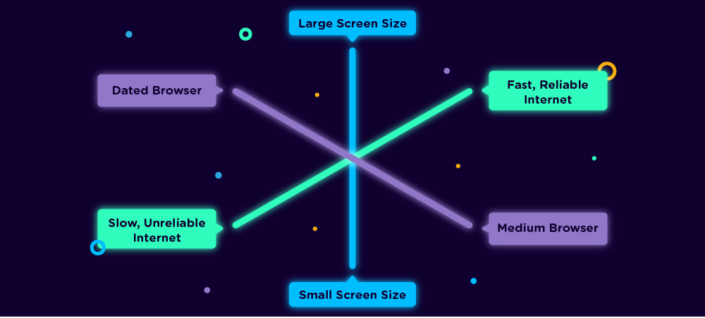
Even if a user is tech-savvy, they may not have a great internet connection in their area.
Even if you decide to cater to a very high-end audience and deliver a very modern experience, you need to consider that not all internet connections are equal. Connection speed varies wildly within South Africa and some connections are intermittent in their performance, for instance Fibre, ADSL, VDSL and mobile connections are all differing options. Page load times are of vital importance to user retention, and an additional second can immensely increase the bounce rate. Remember, if your users get to first meaningful paint faster, then more of them will actually experience your website.
When considering how to deliver a similar experience for both desktop and mobile devices, you need to be careful to ensure that the user journey is equivalent.
This means that a user on any device must have a clear path of action that they can take in order to complete the action you intend for them. These actions should be visible to the user without them needing to search for it, unless invisibility forms part of the experience. In considering different device capabilities, you allow for an experience that translates well across different interfaces - even if they are not necessarily identical.
For instance you can look at this example of how to place a call to action button relative to a device's screen size, but it is important to know that the same placement across devices is not actually equivalent in meaning.
Step 3: Optimise the experience for your audience
At my previous agency, we catered for a more specific target audience, so we decided to deliver an experience that worked on all major browsers back to Internet Explorer 11. In applying principles and fixes to cater to even older browsers at SweepSouth, I have learned that this is not a broad enough approach.
To expand our reach, we need to cater for users who abandon the booking process if they encounter any adverse experiences. We also wish to allow potential new cleaning staff to learn more about the company, and to apply to be what we call "SweepStars". To optimise for these audiences, we must create a seamless experience for every device and, for the most part, it doesn't require much more effort to provide a reasonable experience for a much older device.
Sometimes we have the time to build an amazing web experience, and sometimes we need to build something great with a very short deadline. When you do have the time, you can use Graceful Degradation to build an experience that performs well on all devices, but does amazing things when the device offers shiny new features. When you don't have the time, you can build something that at least works on everything, even if it might not utilise the latest and greatest feature set.
Aim for Graceful Degradation:
An ideal solution to the problem of wildly varied devices is to deliver the best possible experience to the modern browser, and to provide an experience to each browser that it is capable of reproducing. This concept is called Graceful Degradation, which places the emphasis on delivering the best possible experience to newer browsers.
Delivering the same experience is not always possible, but creating a fallback for less powerful technology is common practice and should be considered from the very start of the development cycle. For instance, my team created a global fallback for layout using more modern CSS, knowing that there is stable CSS in place for devices that will not support newer features.
Another excellent example of Graceful Degradation is provided here.
Fall back on Progressive Enhancement:
When time, budget, or other prohibitive factors make it clear that Graceful Degradation is not possible, then we need something to fall back on. In this case, it is essential to use features that are able to work across the broadest possible spectrum of browsers, which will in turn require fewer fall backs for potential edge cases. This process of selecting these features is known as Progressive Enhancement.
- A commonly used library for feature detection is Modernizr, which detects what features a browser has and appends them to the HTML tag of the website. This allows you to target specific browser features using a class name, so only browsers which support it will receive the CSS to allow it.
- Polyfills can be used when making up for missing technology in older browsers. Here is a great example for something like flexbox - where you can build a website that does flexbox like things, but is robust enough to work on the older IE 8.
Something to be aware of:
When building sites with modern technologies, such as the latest JavaScript frameworks, it is important to ensure that you build on stable foundations.
Remember that your framework needs to compile to solid HTML/CSS for the browser.
For example, when using React, one can handle forms by gathering input and sending it on. You can do this almost without using any of the traditional HTML, such as HTML input elements with a wrapping form element and appropriate tags. But, having the form elements as the root of your components allows you to fall back to core HTML principles on very low-end devices. The most important aspect of this is that form submission is handled by React. This means that you may click or press "Enter" and the form will work as expected. With React, it is easy to handle a form submit on a click event by disabling the user ability to submit via the keyboard.
By considering these aspects, you are able to deliver an experience that contains all the functionality of the traditional form, while still utilising the framework with best practices in tact.
The snippet below is an example of the form submit taken from the official React Docs:
class NameForm extends React.Component {

 constructor(props) {

   super(props)

   this.state = { value: "" }


   this.handleChange = this.handleChange.bind(this)

   this.handleSubmit = this.handleSubmit.bind(this)

 }


 handleChange(event) {

   this.setState({ value: event.target.value })

 }


 handleSubmit(event) {

   event.preventDefault()

   // submit form

 }


 render() {

   return (

     <form onSubmit={this.handleSubmit}>

       <label>

         Name:

         <input

           type="text"

           value={this.state.value}

           onChange={this.handleChange}

         />

       </label>

       <input type="submit" value="Submit" />

     </form>

   )

 }

}
Resources
Some resources to get you started with user research and user profiling:
- A Comprehensive Guide To UX Research
- Just Enough Research - Erika Hall
- User Research – Methods and Best Practices
- A List of Tools for User Research
Some resources to consider when debating the necessity of fancy, new website features:
In South Africa, a large portion of our user base falls into what is considered the next billion users. Since many companies are trying to target this segment, it is interesting to see their perspectives on the user base, and how it might differ from our own understanding:
- How insights from user research help us build for the next billion
- The next billion users are the future of the internet
An excellent resource and industry standard for determining what browsers support in terms of HTML and CSS features:
Dieter Buntzen is a self taught Javascript developer with a background in UX and design. As the front-end developer at SweepSouth, he works extensively with React and Next.js. He values accessibility and performance above other concerns.